UX Case Study
Pedal Stoke UX Audit
A comprehensive usability evaluation of a Boulder-area custom bike bag company.
Introduction
Pedal Stoke is a Boulder-area custom bike bag company operating at pedalstoke.com. The site's primary function is to sell and facilitate orders for a range of customized cycling bags, racks, and mounting systems. As an avid cyclist local to Colorado, I approached this audit both as a practitioner of user experience design and as a prospective customer, a vantage point that revealed substantial gaps between the site's communicative ambitions and the experience it actually delivers.
Objective
This audit evaluates Pedal Stoke's website across six dimensions: first impressions and business context, persona-driven analysis, heuristic evaluation, information architecture, user journey, and accessibility. Together, these lenses reveal a site with a clearly defined product and dedicated audience, but one whose visual design, navigational structure, and content strategy consistently undermine user trust and conversion.
My role
I was the sole auditor and UX researcher for this project. My responsibilities included conducting business context analysis, persona development, heuristic evaluation, card sorting exercises, user journey mapping, and accessibility testing.
Business Context
First impressions
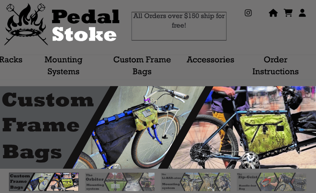
- Oversized elements across the site (large navbar, big text)
- Dominant gray color scheme gives a bold, in-your-face appearance
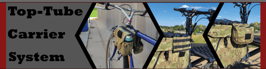
- Immediate visual focus on product customization and variety
Target audience
Primary audience:
- Cyclists, particularly Americans in the Boulder area
- Age range: 20–50, with interests in cycling and commuting by bike
Secondary audience:
- Gift buyers looking for bags for cyclist friends
- Individuals who may not be cyclists but need a bag for their bike
Competitors
Main competitors include JPaks, Green Guru Gear, Oveja Negra, and Ortlieb.
Persona-Driven Analysis
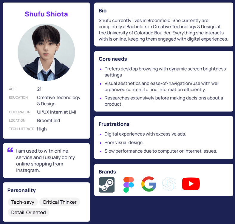
To evaluate the site's communication effectiveness beyond my own frame of reference, I constructed a user persona: Shufu Shiota, a 21-year-old student and UI/UX intern from Broomfield who is tech-savvy and prefers desktop browsing with dynamic screen brightness settings.
Key insights from persona analysis
- Homepage feels cluttered with a dark mode aesthetic that is overwhelming
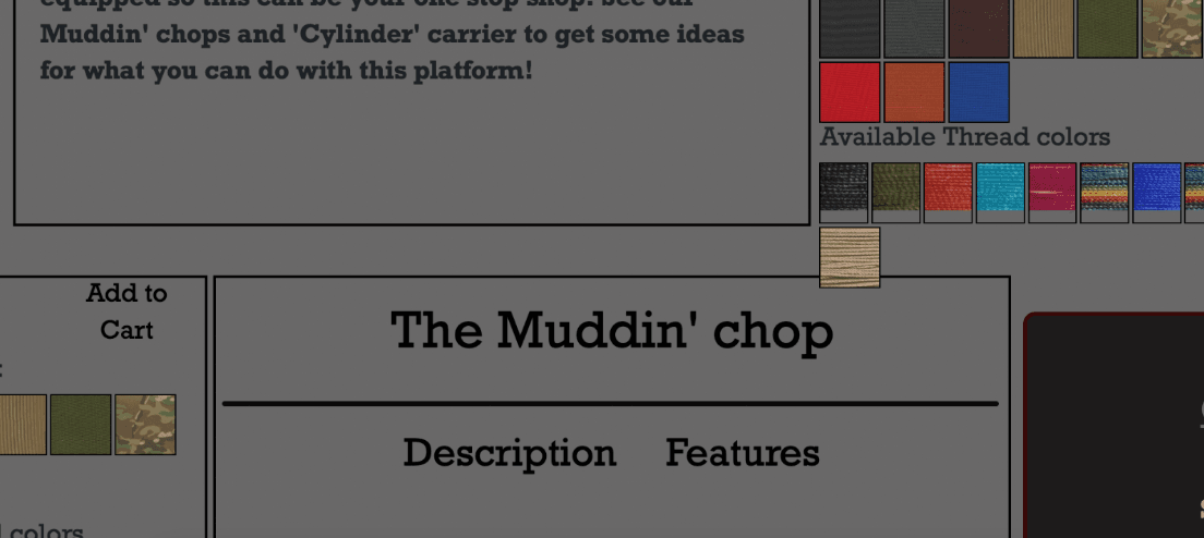
- Key information is hard to locate due to shifting text and UI elements
- Overly large fonts, images, and misaligned objects create a distracting experience
- Accessibility issues include partially clickable navigation and confusing hover effects
- Excessive text and poor visual design make it hard to digest important product information
Emotional journey
- Moment 1: First impression on the Orbiter page—appreciates detailed info and gifs but is overwhelmed by lengthy text
- Moment 2: While navigating the Orbiter page—faces frustration due to large text and overwhelming information
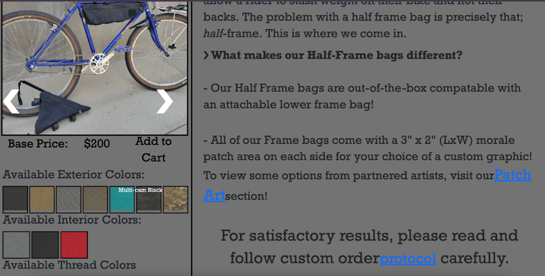
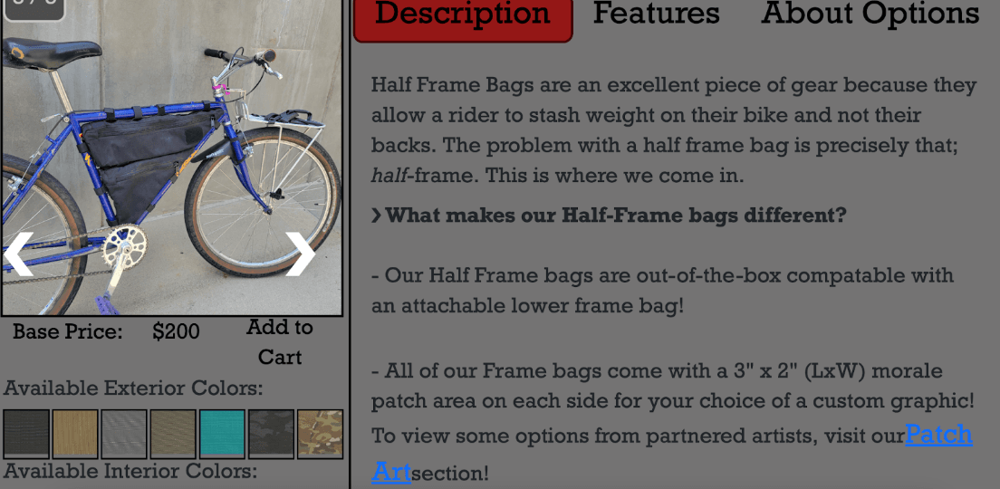
- Moment 3: On the Half Frame Bag section—encounters misaligned text and hover issues, leading to confusion
Heuristic Evaluation
Evaluated against Nielsen's established usability heuristics, Pedal Stoke presents a mixed picture with both strengths and critical weaknesses.
What works well
- Immediate visual cues (hover effects, clickable color options, navigable images)
- Uses familiar icons and language (shopping cart, social media logos, underlined links)
- Detailed product information is provided
Critical issues
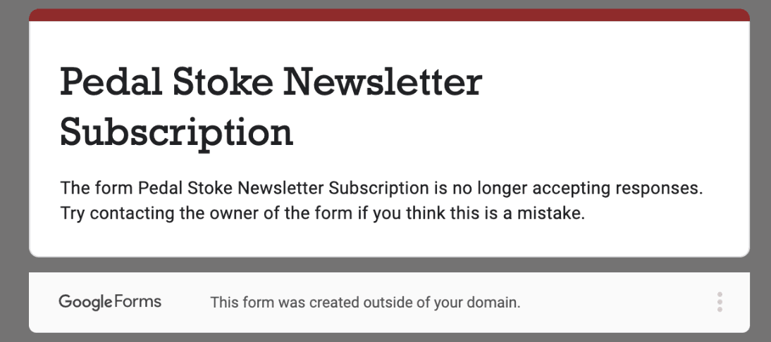
- Shopping cart is broken and continuously loading
- Some links misbehave (e.g., redirecting to the top of the page)
- Limited options for undoing actions
- Minimal error prevention measures and lack of clear error messages
- Mobile navigation is problematic due to cluttered layouts
Visual Design & Cognitive Biases
Cognitive biases identified
- Confirmation Bias: Homepage emphasizes free shipping over $150 and highlights rack products, reinforcing assumptions about user priorities
- Anchoring Bias: The $150 shipping threshold sets a pricing anchor, influencing perceived value and spending decisions
- False Consensus Bias: Product names like "Li-BAR-ator" lack context, assuming user familiarity with internal naming
- Framing Bias: Promotions styled to highlight gains (e.g., free shipping), nudging impulse decisions
Visual design evaluation
- Layout & Structure: Grid-based and logically structured, though mobile product cards feel tight
- Color & Contrast: Mostly meets accessibility standards, but red usage and icon hover feedback could be improved
- Typography: Clear hierarchy with limited font use and good readability
- Feedback & Affordances: Some buttons lack visual cues; hover states inconsistent
Information Architecture
Card sorting exercise
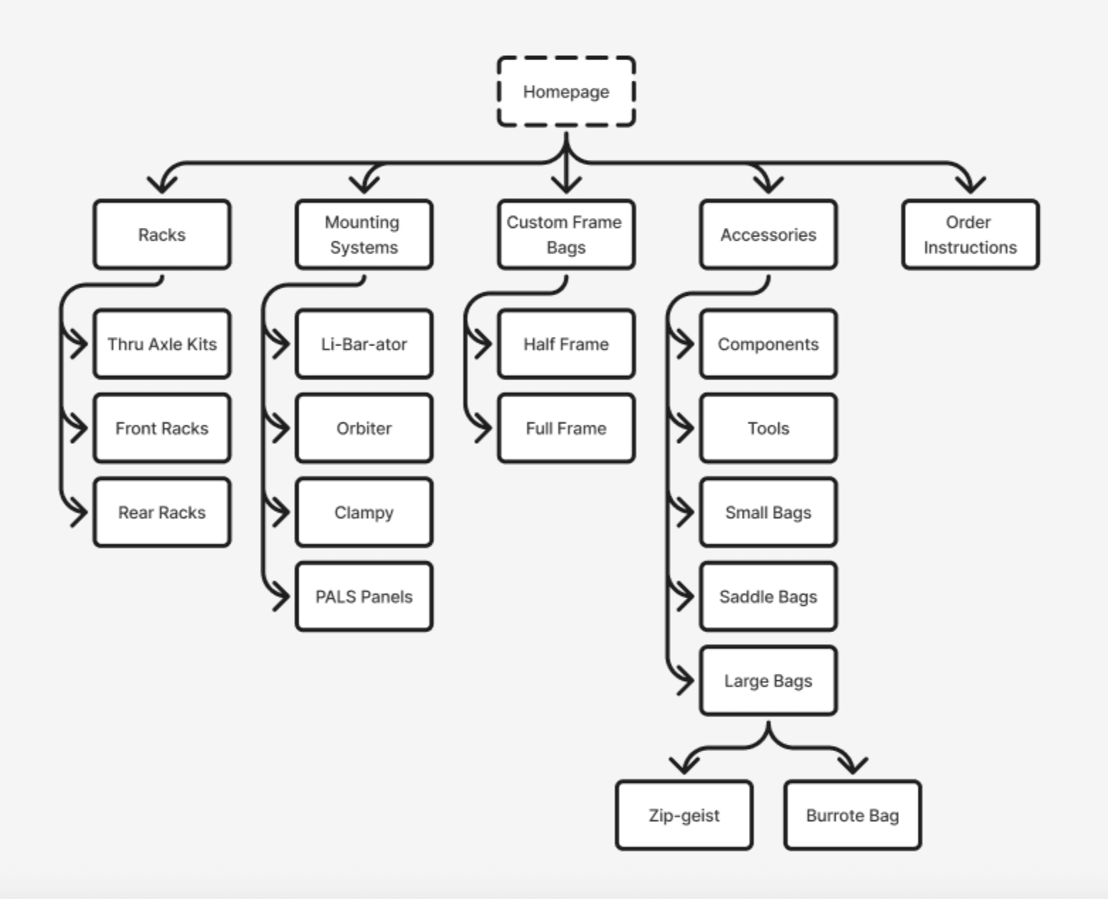
I conducted a card sorting exercise with two participants to evaluate the site's navigation structure. The exercise revealed strong agreement on primary categories (Racks, Custom Frame Bags, Accessories) but confusion around ambiguous product names.
Areas of confusion
- Product names like "Clampy", "Components", and "Tools" lacked clarity and caused inconsistent placement
- Both users ignored the "Order Instructions" category, indicating low perceived relevance or unclear labeling
- Users confidently categorized internally named items despite ambiguity, suggesting potential overfamiliarity on the part of the brand
Recommendations
- Clarify product labels—use more intuitive names or hover/tooltips for terms like "Clampy" and "Zip-geist"
- Revise or remove "Order Instructions"—rename to "How to Order" or integrate within relevant product pages
- Test with more users using think-aloud protocols to better understand decision logic
User Journey Evaluation
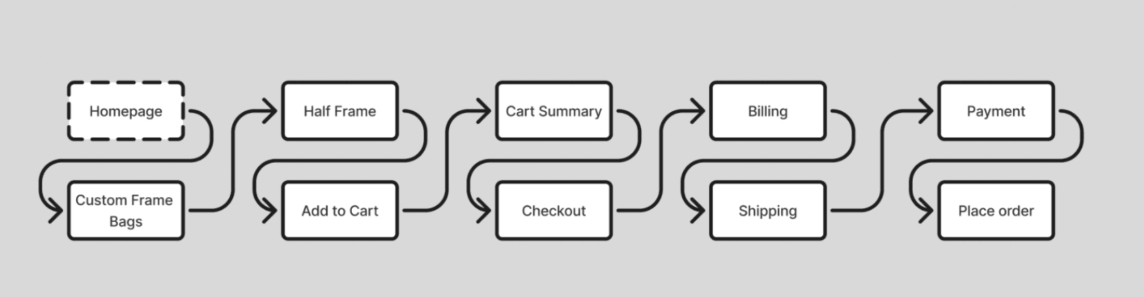
Mapping the primary user journey from homepage entry through product selection, cart, and checkout revealed a workflow that is functional in its broad strokes but compromised by specific, addressable failures.
What works well
- Navigation and basic functionality (selecting bags, adding to cart, checking out) are mostly clear and functional
- Checkout and form filling (billing, shipping, payment) are straightforward
- Error handling and form feedback like auto-populating addresses work well
- Final confirmation after order placement is present and effective
Biggest pain points
- Color selection is missing or unclear when adding a bag to the cart
- Visual overlap issues when hovering in navigation and on product details
- Users enter billing info before shipping, which is unconventional and may cause confusion
- Cart viewing is inefficient if users want to immediately check bag details after adding
- Inconsistency in design between pages like payment page vs. homepage
Accessibility Evaluation
Accessibility represents the audit's most significant area of concern, and one with direct implications for both usability and legal compliance.
Key issues identified
- Color Contrast Problems: Hover text and underlined links fail WCAG contrast standards, making them hard to read for users with low vision
- Screen Reader Limitations: Buttons like "home," "checkout," and image arrows lack accessible labels. Some text moves unpredictably or is not read aloud
- Keyboard Navigation Issues: Navigation bar is not fully accessible by keyboard; some buttons can't be activated, and focus indicators are inconsistent
Impact
Many visual features were not accessible by assistive technologies. These gaps can prevent users with disabilities from navigating the site or making purchases, reducing usability and inclusivity while creating potential legal compliance issues.
Strategic Recommendations
High priority
- Fix the broken shopping cart—this is a critical conversion blocker
- Allow color and add-on selections directly on the product page before adding to cart
- Add alt text to all images and descriptive labels to all interactive elements
- Ensure full keyboard access and visible focus states for all interactive elements
- Adjust color contrast for all interactive text elements to meet WCAG standards
Medium priority
- Reorder form fields to place shipping info before billing
- Fix hover interactions and overlapping UI elements
- Standardize naming and formatting site-wide
- Streamline navigation by adding clearer labels or categories
- Improve content layout with better use of headings
Lower priority
- A/B test featured products and pricing banners to reduce anchoring bias
- Enhance hover/active states and button clarity for stronger feedback
- Adjust mobile padding and layout tightness for better readability
- Promote product diversity beyond rack items and shipping thresholds
- Add a live bag preview or mockup based on selected options
Reflection
This audit process highlighted the importance of systematic UX evaluation. By analyzing the site through multiple lenses—heuristics, personas, information architecture, and accessibility—I was able to identify patterns of issues that likely stem from a lack of user testing and iterative design.
The exercise of creating and analyzing through Shufu's persona was particularly valuable. It confirmed known issues like clutter and slow performance while uncovering new pain points such as excessive text and UI misalignment. This broadened my perspective by considering differences between desktop and mobile experiences and built empathy for diverse users.
If I were to continue this work, I would conduct additional usability testing with actual Pedal Stoke customers to validate these findings and prioritize recommendations based on business impact and implementation effort.
Conclusion
Pedal Stoke has a clearly defined product and dedicated audience, but critical usability and accessibility issues prevent the site from reaching its full potential. The broken shopping cart, unclear product customization flow, and accessibility barriers create significant friction in the user journey.
By addressing the high-priority recommendations—particularly fixing core functionality and improving accessibility—Pedal Stoke could dramatically improve user trust, conversion rates, and inclusivity. The site's bold visual identity and detailed product information provide a strong foundation; what's needed now is a user-centered approach to refining the experience.