UX Case Study
Denver Zoo Website Redesign
Streamlining ticketing for a clearer, faster user experience.
Introduction
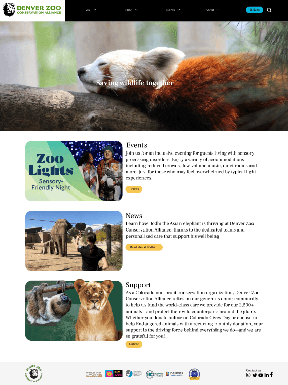
For this project, I assessed the user experience of the Denver Zoo's website and proposed a redesign. The current site is confusing and time-consuming, making it difficult for users to buy tickets. The redesigned version streamlines the ticket purchasing process, making it more efficient and user-friendly.
My role
I was the only designer and researcher for this project. My responsibilities included conducting user tests and creating low, mid, and high-fidelity designs.
Challenge
Denver Zoo visitors need a way to purchase tickets quickly and easily online because the current process can be confusing and time-consuming. They want to streamline the experience so they can enjoy more of their time at the zoo.
Research
User testing of the current experience
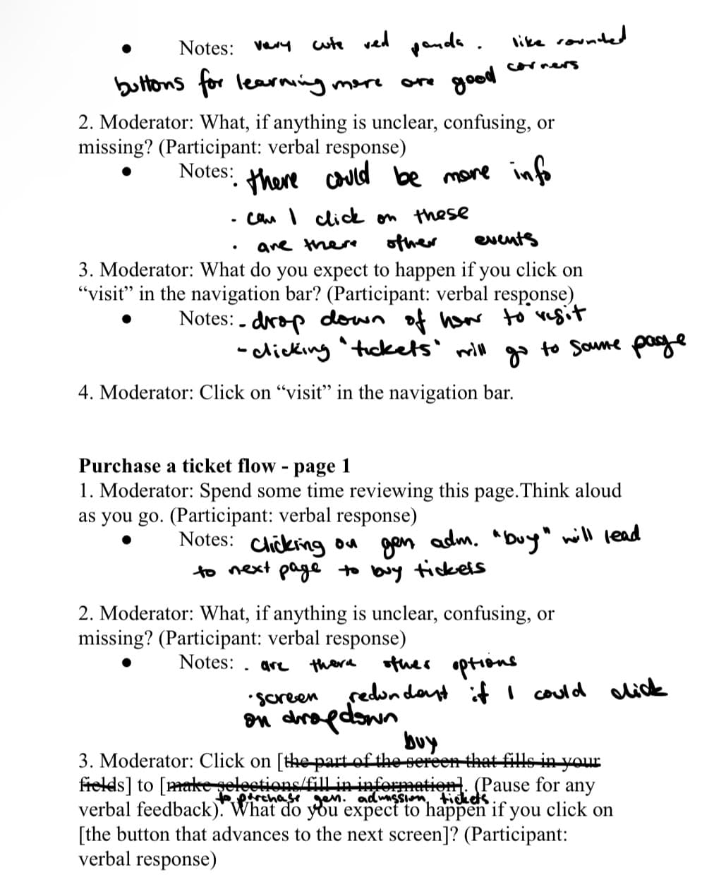
To evaluate the Denver Zoo’s ticketing experience, I conducted usability testing with five participants who met the screening criteria. Each participant walked through the ticket-buying flow while I observed their interactions and captured feedback.
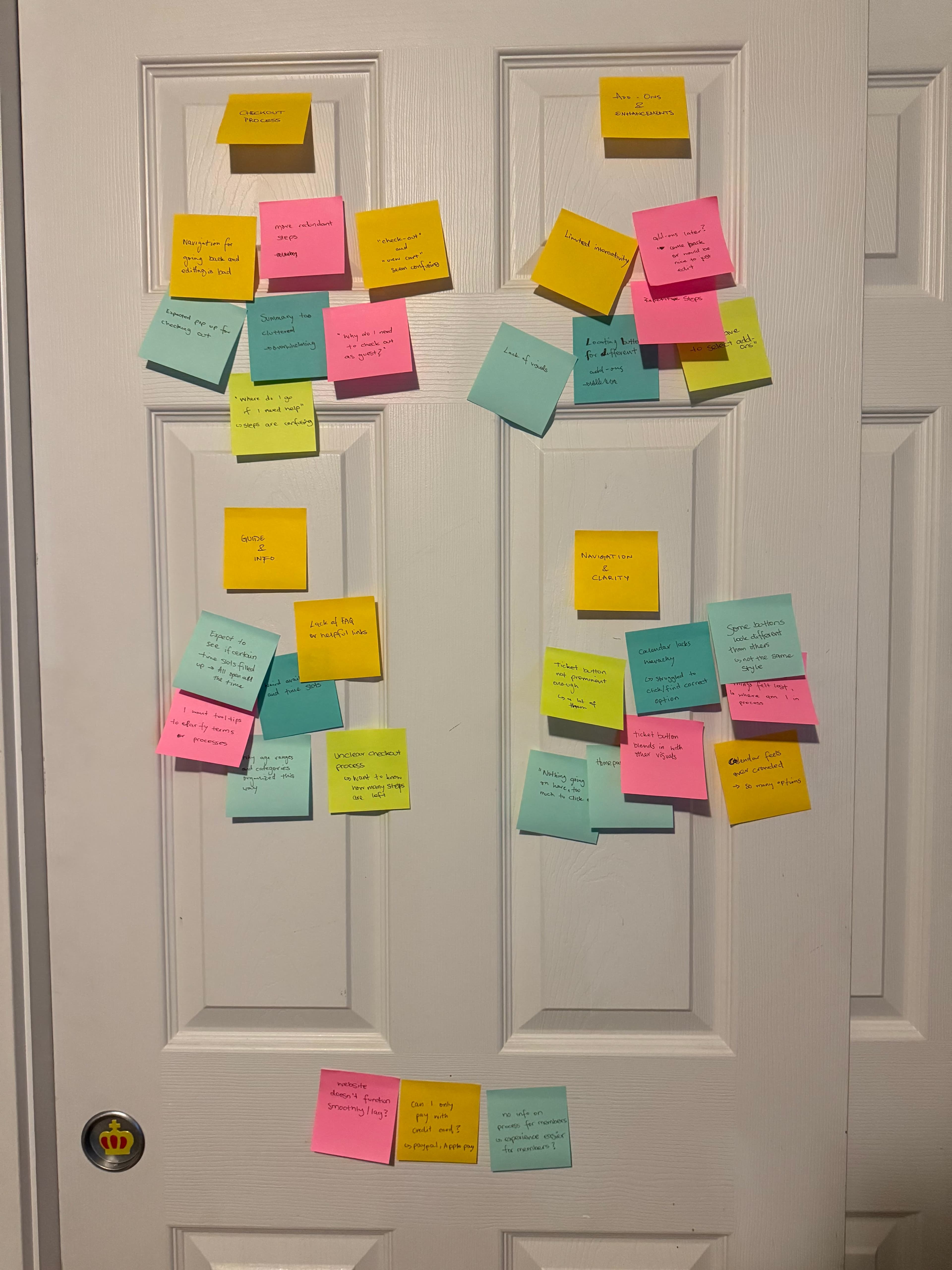
Key pain points:
- Overcrowded homepage made it difficult to prioritize actions
- Unclear ticket categories and inconsistent visibility of important buttons
- Frustration with the calendar interaction
- Lack of confirmation feedback when adding items to the cart
- Users often lost track of progress; the process took too long
These findings revealed opportunities to streamline navigation, clarify ticket options and add-ons, improve purchase-flow feedback, and declutter the cart summary for a smoother experience.
Competitive analysis
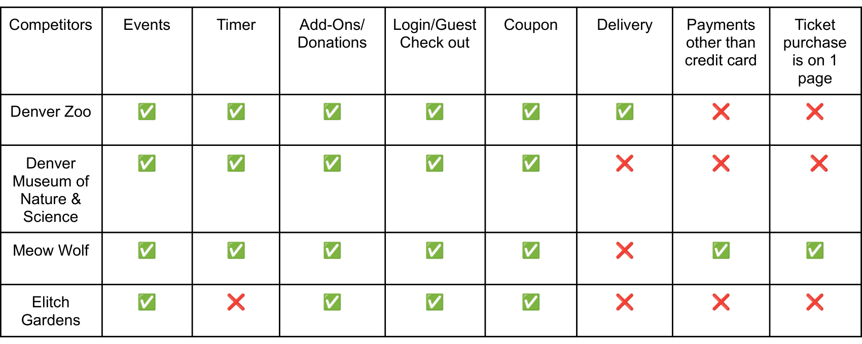
I compared the Denver Zoo site to the Denver Museum of Nature & Science, Meow Wolf, and Elitch Gardens to identify strengths and opportunities.
How might we…
- Make the homepage and ticketing navigation clearer?
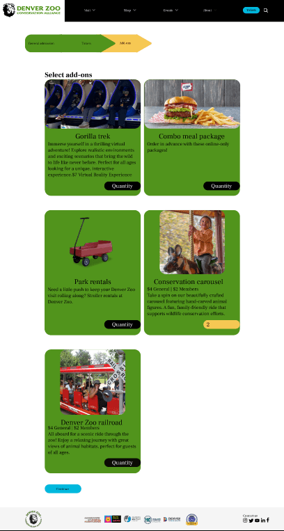
- Improve the add-ons page with better visuals and intuitive selection?
- Streamline the cart and checkout process to reduce confusion?
Design
User flow
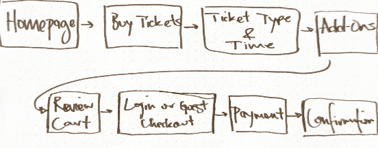
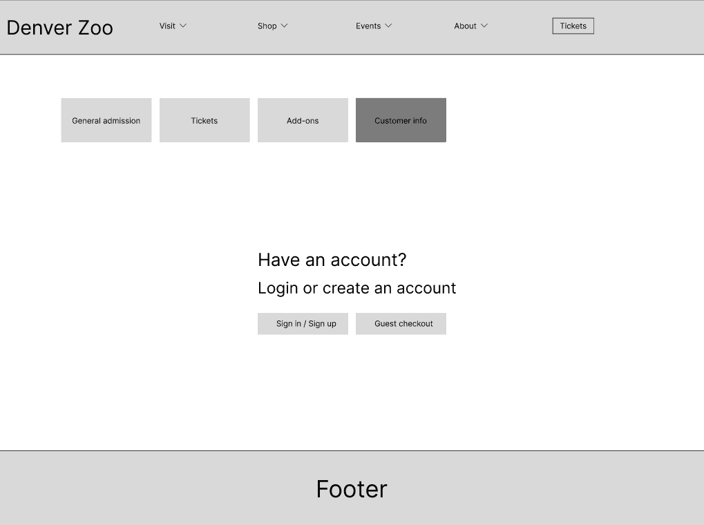
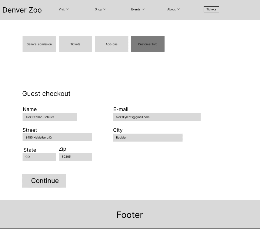
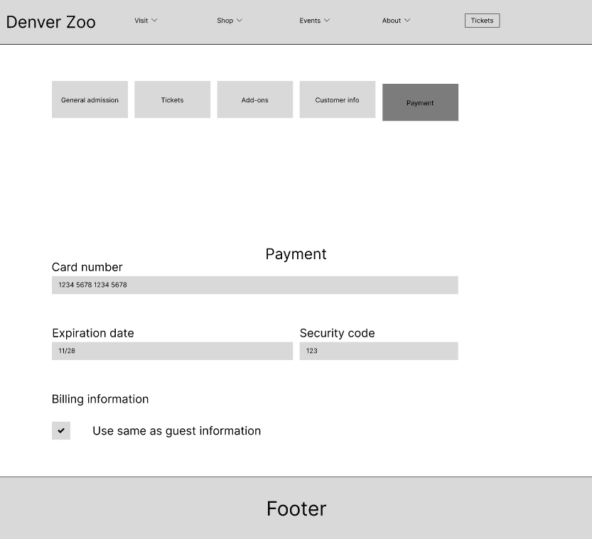
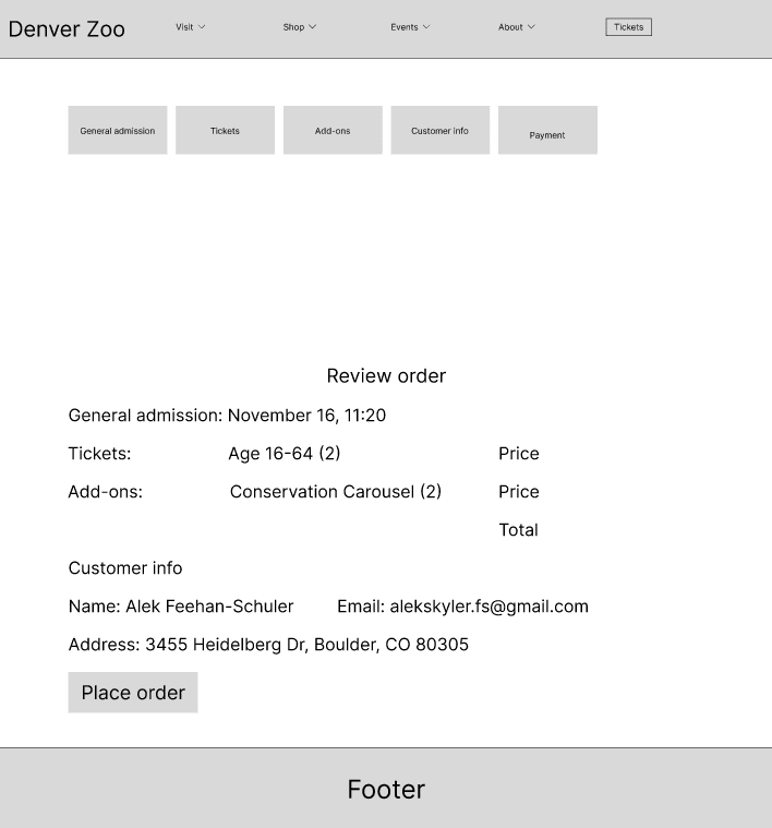
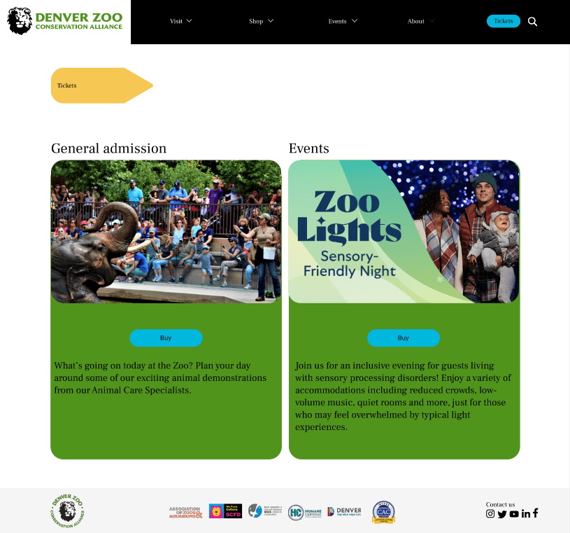
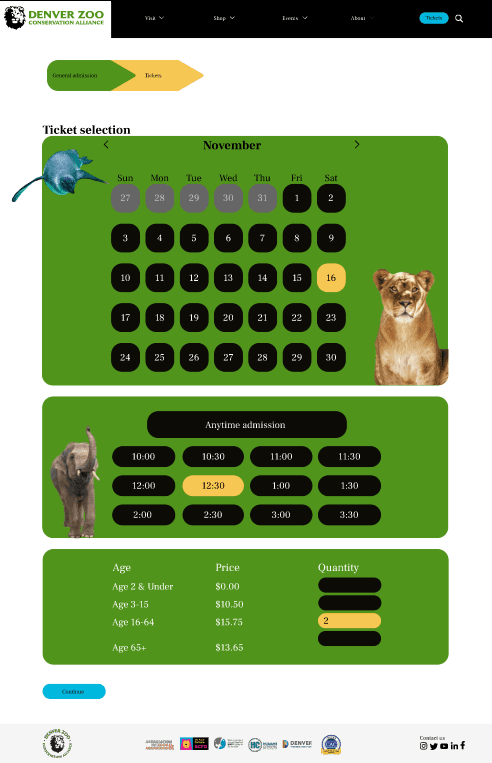
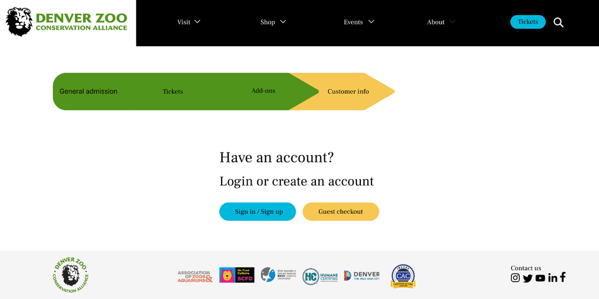
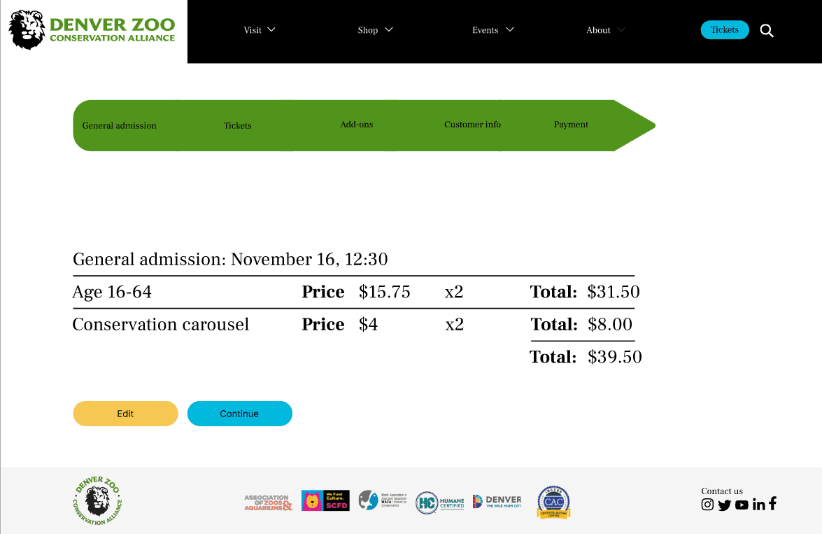
I designed a simplified ticket-buying flow starting from the homepage and guiding users through tickets, add-ons, a review step, and confirmation. A Login/Guest Checkout option reduces friction, while a dedicated Review Cart screen improves transparency and confidence.
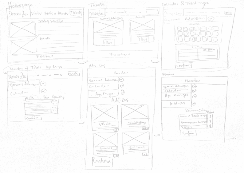
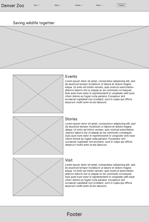
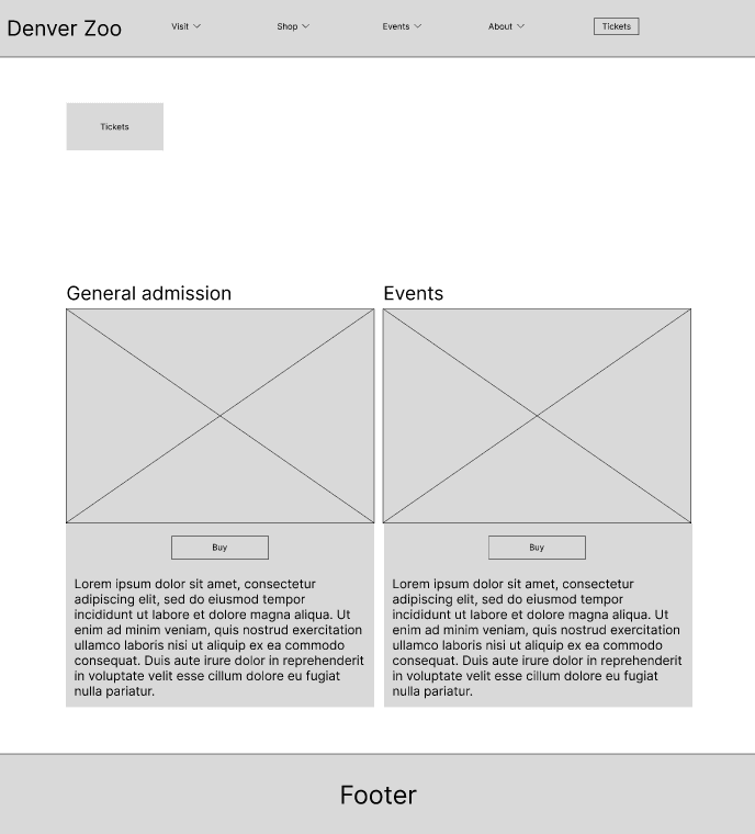
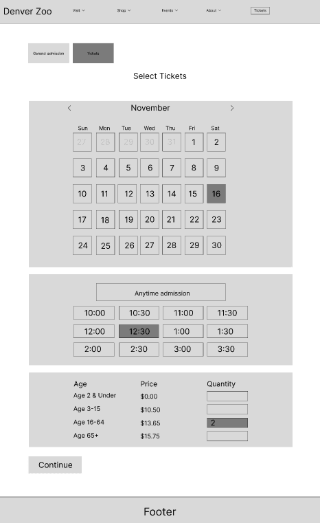
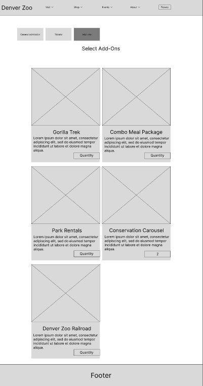
Low-fidelity wireframes
Mid-fidelity wireframes
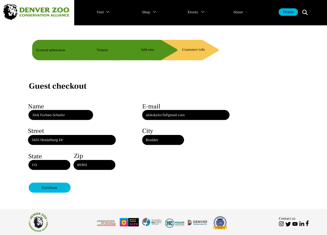
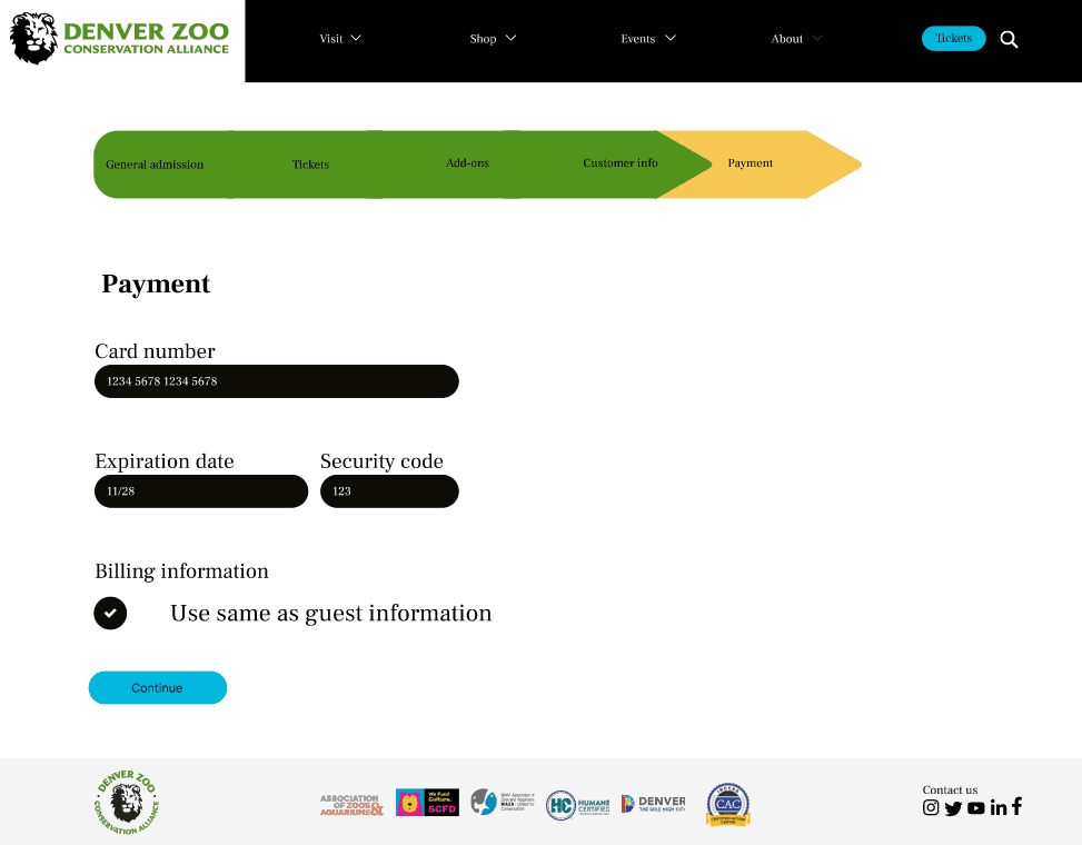
High-fidelity interactive prototype
Instructor feedback
Throughout the design process, I received valuable feedback across all fidelity levels.
Low-fidelity
- Use sentence case for text
- Wireframe full pages, not partials
- Use a progress stepper instead of accordions
- Improve quantity input usability
- Include both empty and filled versions of forms
Mid-fidelity
- Maintain consistent spacing (multiples of 8)
- Ensure 72px padding between final element and footer
- Clarify text hierarchy
High-fidelity
- Use sentence case throughout
- Ensure AA color contrast compliance
- Left-align all text
- Improve structure of Review page
Evaluation & Results
User testing process & pain points
I conducted two usability tests on the high-fidelity prototype. Participants evaluated each screen while I observed interaction patterns and captured pain points.
Key findings:
- User #1 was confused by the nav bar and expected to buy tickets from “Visit.”
- The homepage felt overwhelming but informative.
- User #2 found the pricing/ticketing process chaotic and unclear—especially selecting quantities before entering information.
- The Confirmation page layout needed clearer hierarchy and more visual communication.
Updates
Based on user feedback, I plan to redesign the homepage navigation with a clearer “Get Tickets” button and stronger color contrast.
I will reorganize spacing and hierarchy on the pricing page for better clarity—avoiding table-like layouts and simplifying the information order.
For the Confirmation page, I will restructure the layout so information appears in the order users provided it: tickets → add-ons → total price → customer info.
Reflection
If I had more time, I would incorporate more visual branding from the Denver Zoo, experiment with richer UI patterns, and refine the progress stepper and input system.
As my first UX project, this experience taught me the importance of research, iteration, and consistent usability testing. Even small changes can dramatically improve the user experience.
Conclusion
This project strengthened my understanding of user-centered design. I gained confidence in synthesizing insights, designing structured flows, and applying feedback to build a more intuitive, accessible, and enjoyable digital experience for zoo visitors.