Brand & Product Design
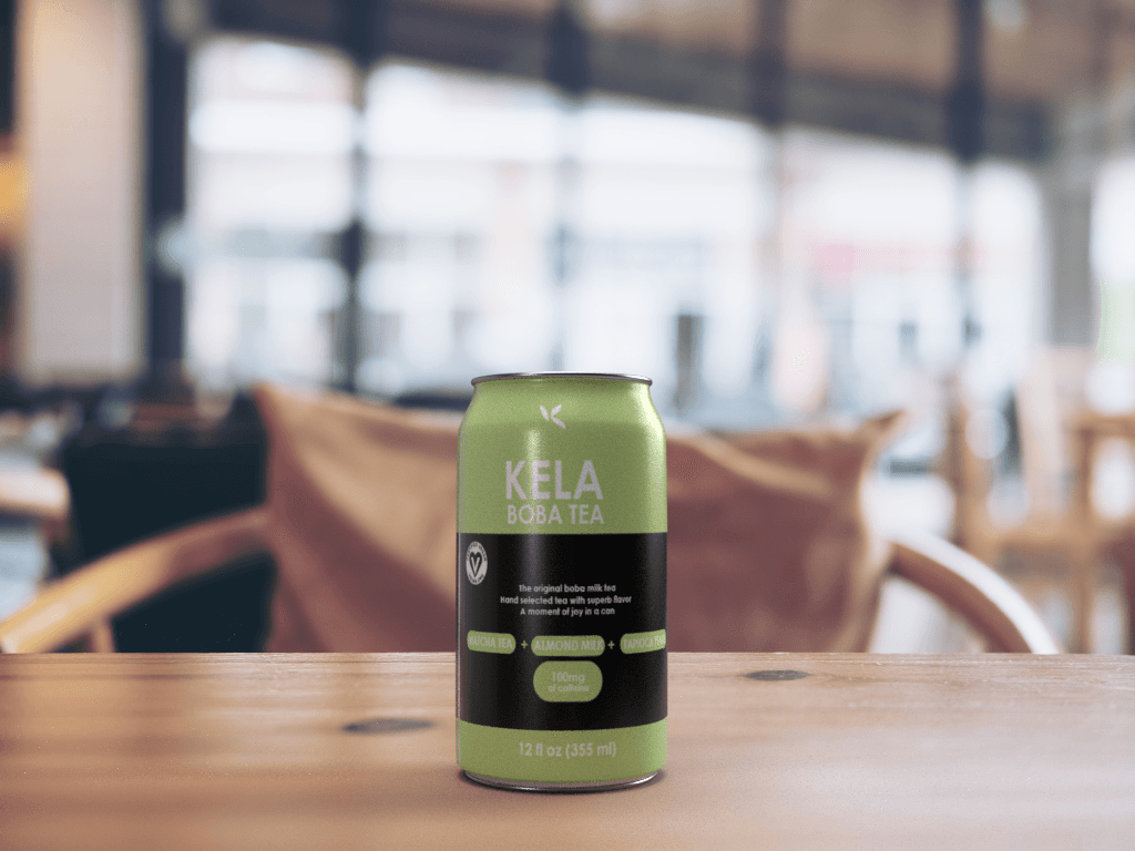
KELA Boba Tea
A boba brand that blends illustration, typography, and personal identity.
Overview
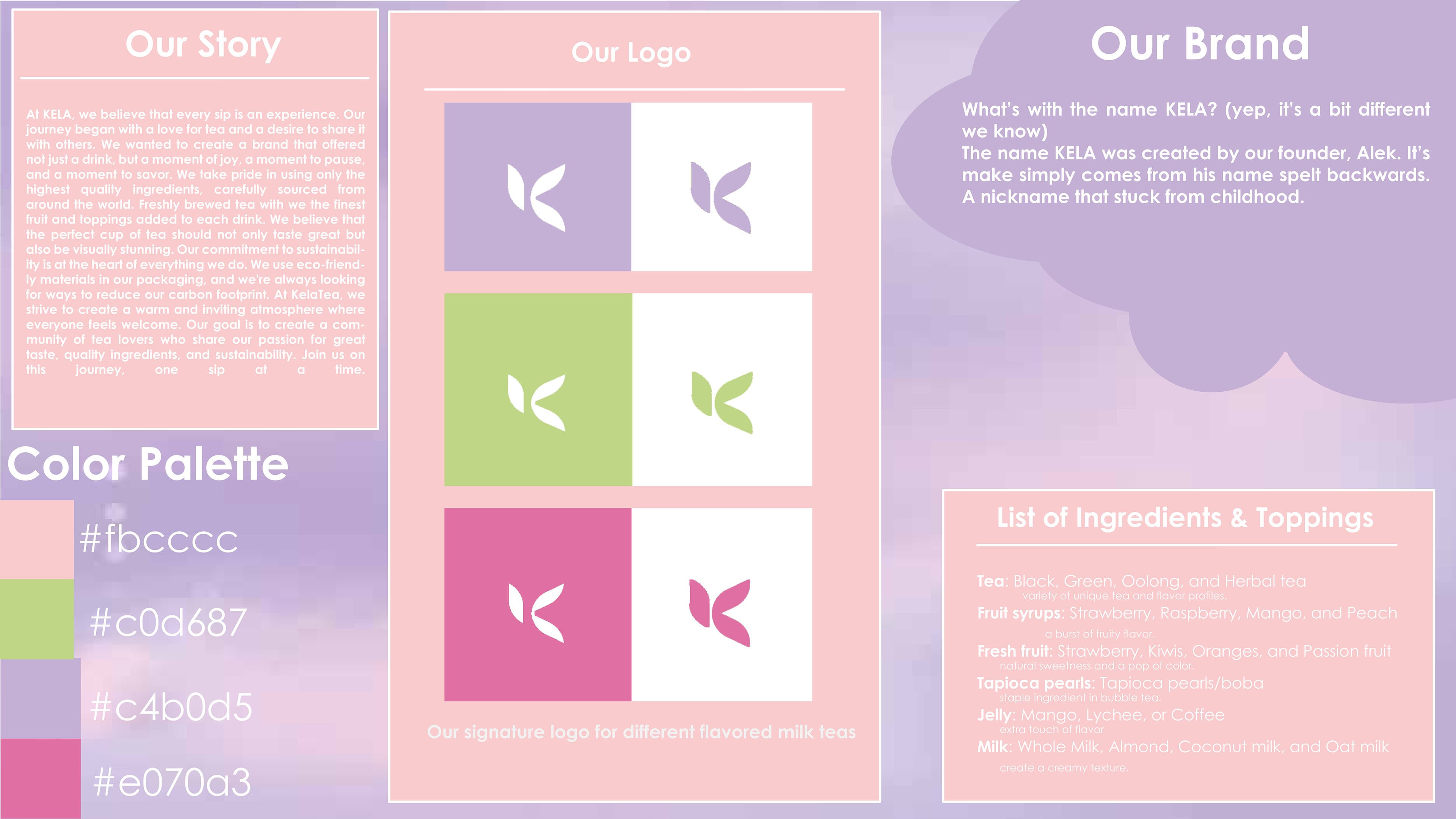
For KELA Boba Tea, I designed a product and brand system that reflects my personal identity and visual style. I aimed for a well-balanced design that integrates typography and illustration in a way that feels expressive, playful, and like something I would genuinely pick up and drink.
The brand explores how packaging can communicate personality at a glance, using color, shape, and character design to tell a story before anyone even takes a sip.
Process
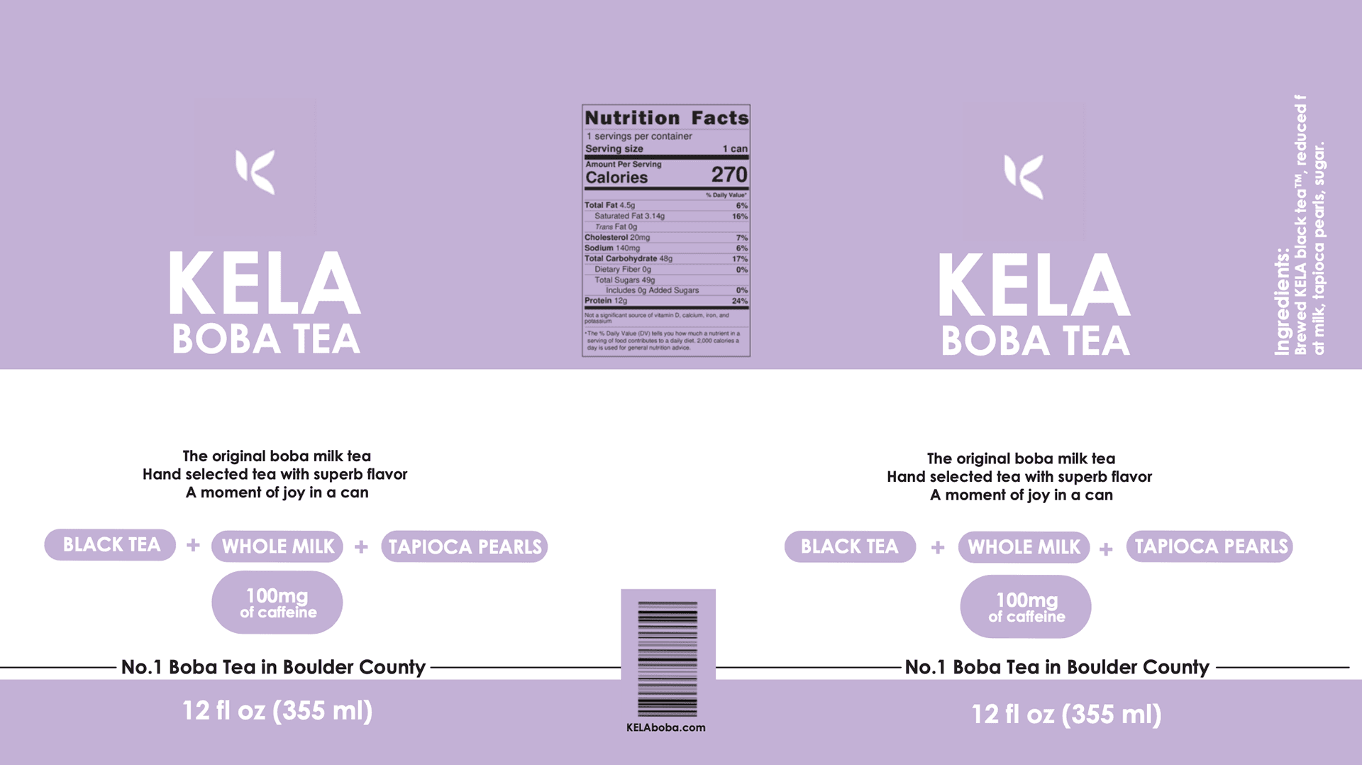
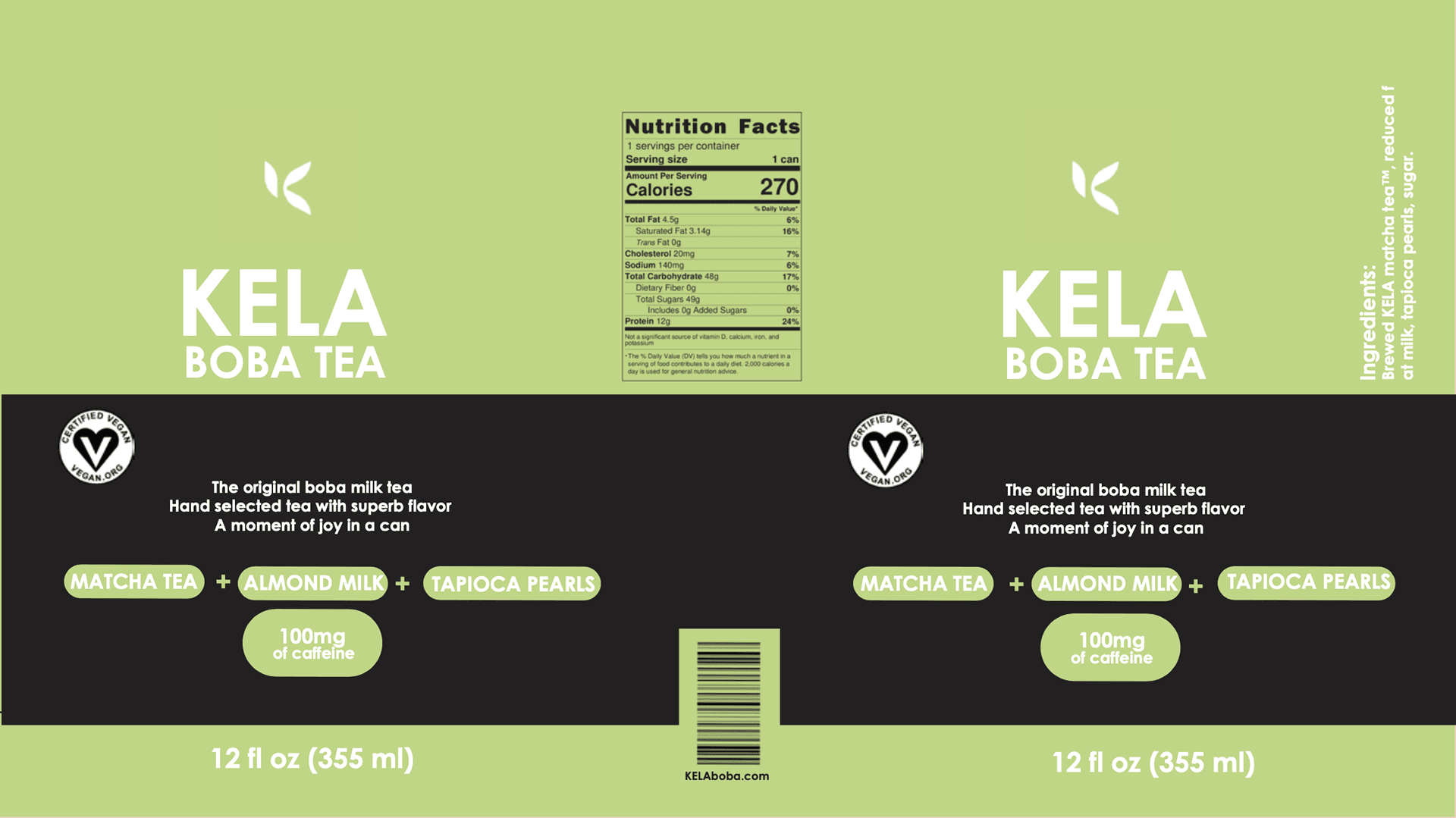
I began by sketching early layout explorations, focusing on how typography and illustration would coexist on a small can surface without disrupting clarity. These early steps allowed me to balance structure with personality.
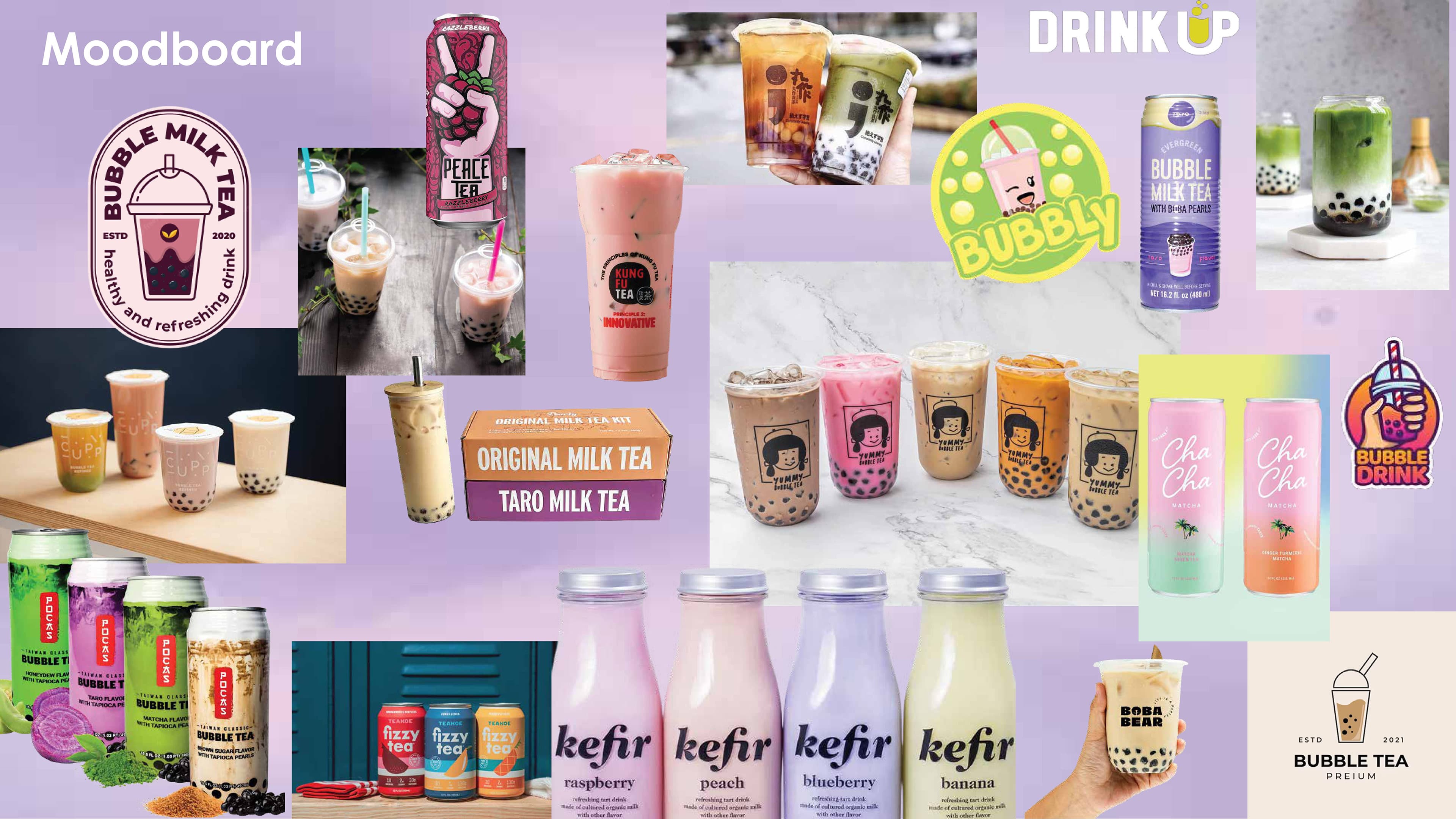
I experimented with vibrant color palettes and line styles to create a visual language that feels playful but still clean and intentional.
Mockups
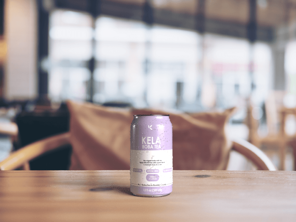
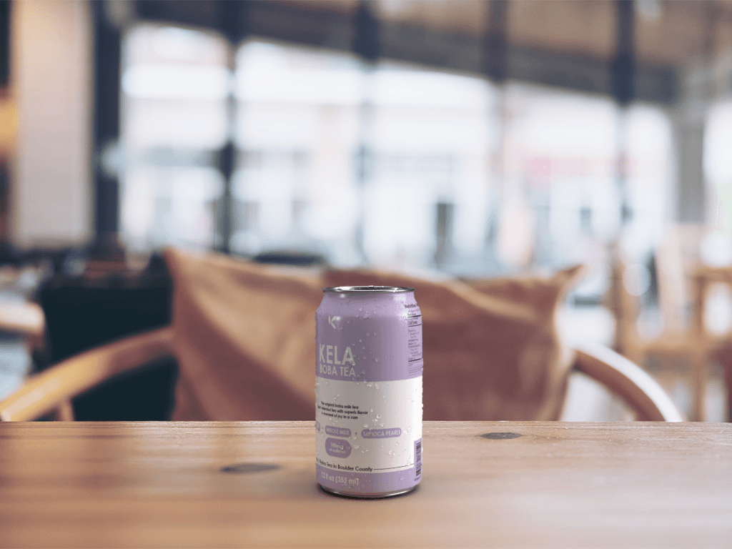
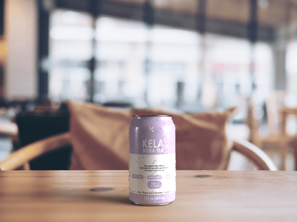
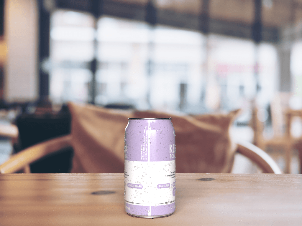
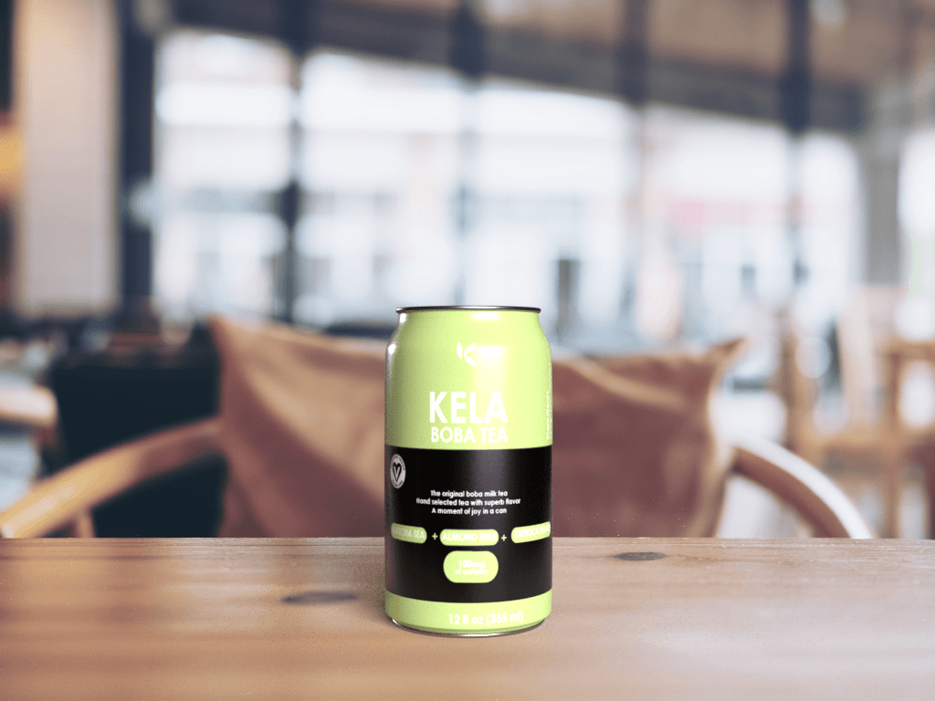
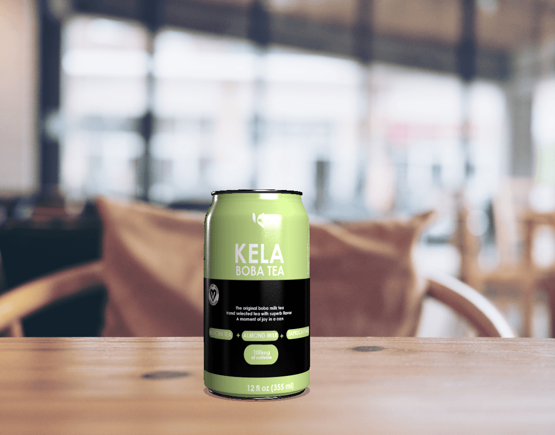
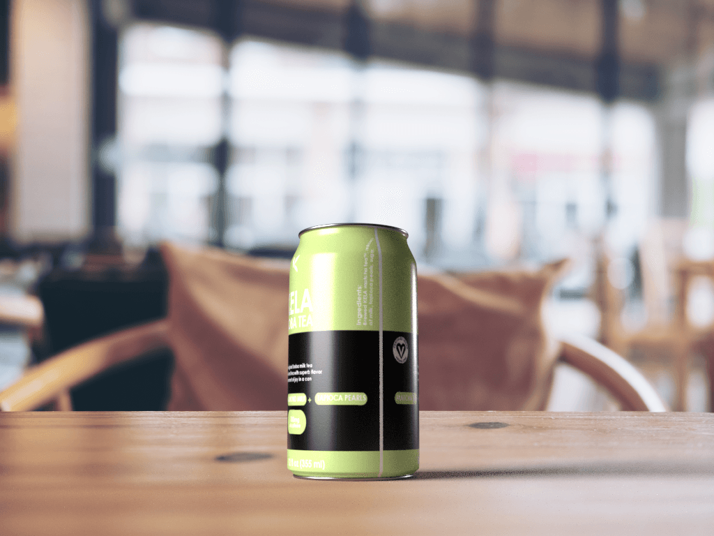
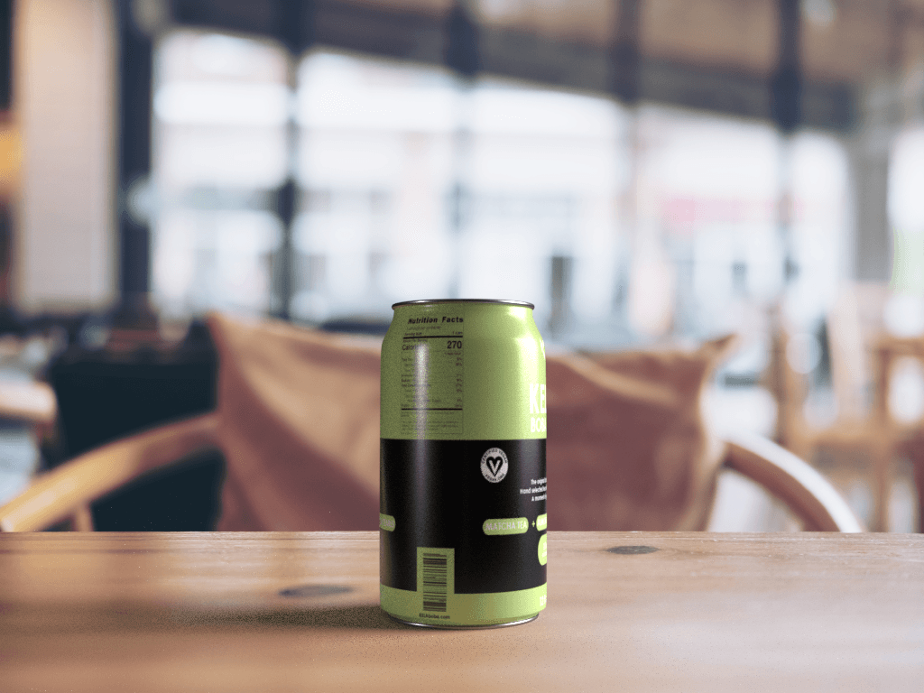
After finalizing the brand system, I created product mockups to visualize how KELA Boba would appear in real-world settings. These were essential for checking visual hierarchy, readability, and brand impact on packaging.
Renders in project grid
Final renders show how KELA Boba functions as a complete visual identity: on shelves, in promotional scenes, and as part of a cohesive brand world. These emphasize consistency, color harmony, and personality.